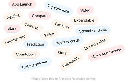
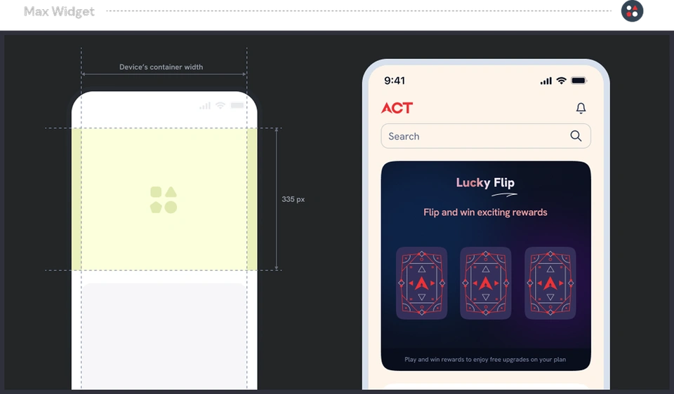
The designs were ready. The content was not, and nobody could say what should go in it. I proposed a named widget system, each one tied to a business KPI, so both sides finally had something specific to work from.
Role
Visual design lead, leading the design team
Platform
Mobile app, Android and iOS
Year
2023
Recognition
A' Design Silver, Interface and Experience DesignHonorable mention - DNA Paris Design Award, 2024
The deadlock
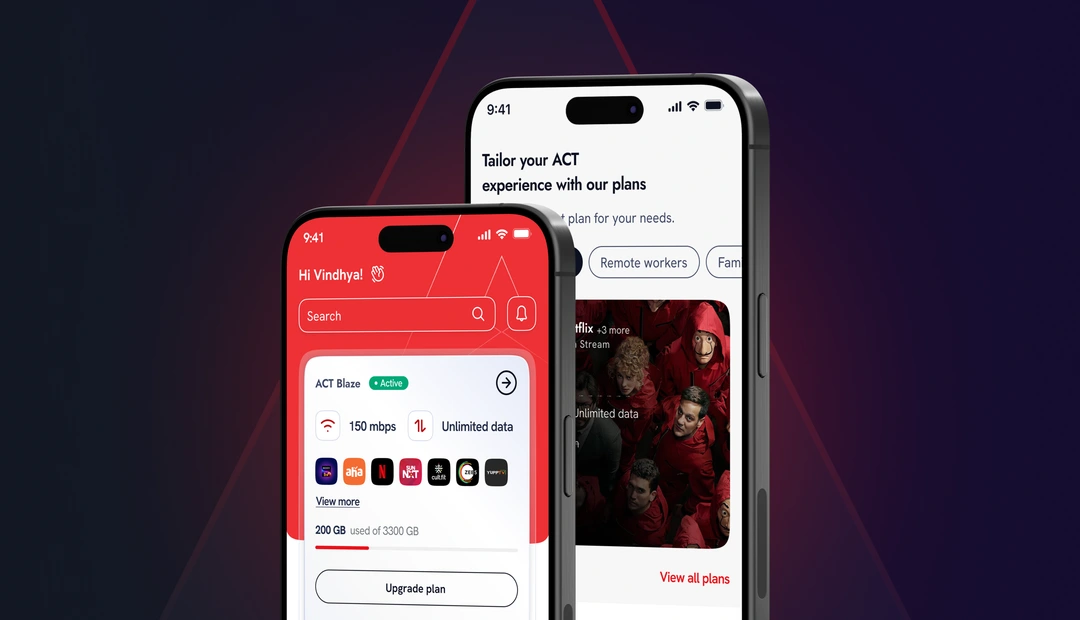
I was leading the UI design team and we were hitting every milestone. But a lot
of the home screen was placeholder: dummy game artwork sitting in a slot meant
to bring users back, generic imagery where offers would eventually go. The UX
team had no way of knowing what content would actually exist there.
The client’s position was fair. They could not commission content without
knowing exactly what each slot needed, and we could not specify the slots
without knowing what content was coming. It went back and forth for weeks with
nobody wrong and nothing moving.
What we were designing against
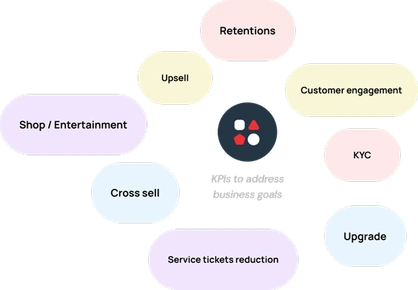
One of the KPIs the GM brought to that session was upgrades: get customers onto
a higher plan for ₹100 more a month. The numbers behind it are what made the
stalemate expensive.
5%
110,000 customers
Out of 2.2M customers
110,000Customers
×
₹100Per month
=
₹1.1CrAdditional revenue / month
Figures as shared by the client at the time. Target, not outcome.
What I did
01
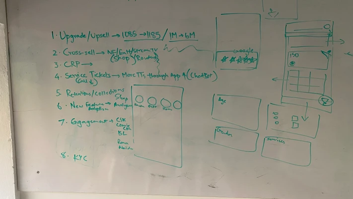
Got the marketing lead in a room
I invited the GM of marketing to our office for a brainstorming session. Not
a review. A working session, so the person who owned the KPIs and the people
designing the slots were solving the same problem at the same table.
02
Set an OKR framework
Turned what came out of that session into clear, measurable objectives with
the team, so every slot on the home screen had a business job rather than a
placeholder image.
03
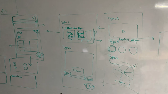
Proposed the widget system
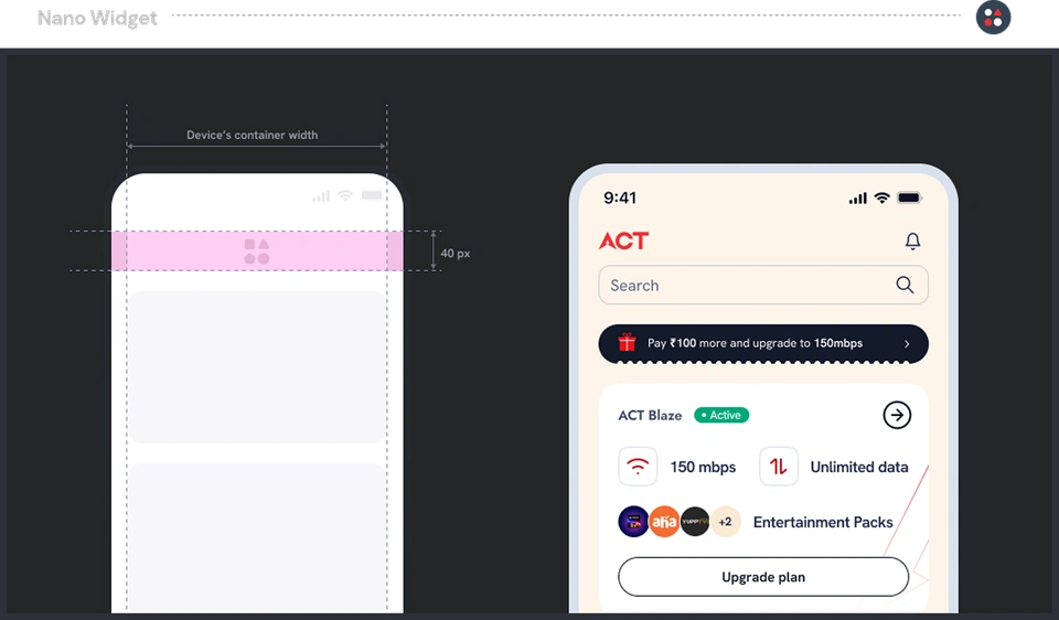
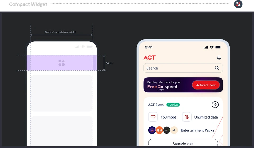
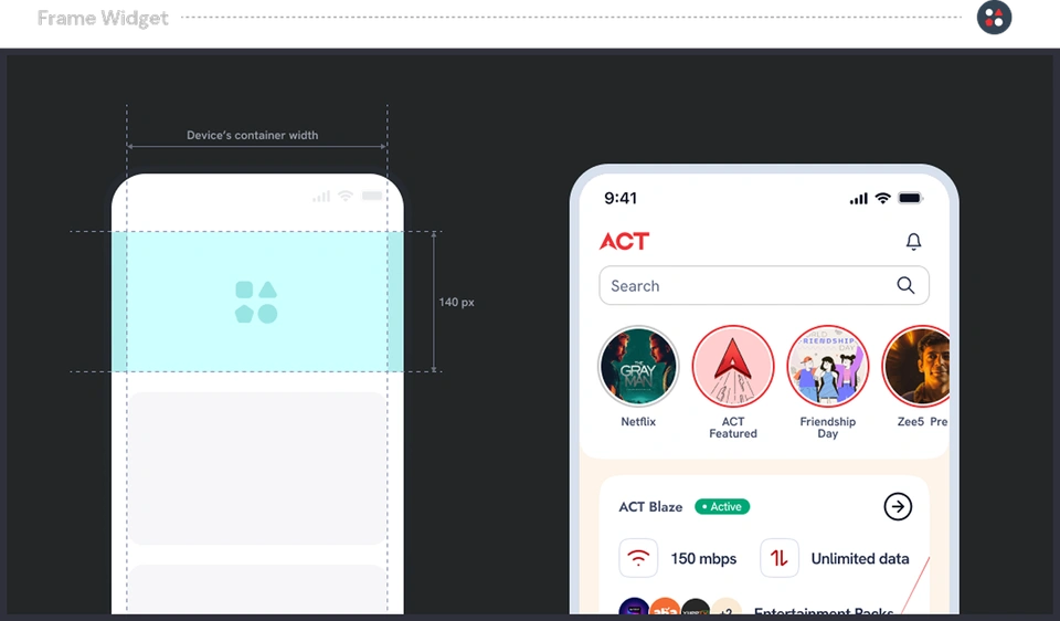
Instead of placeholders, named widgets: each with a fixed size, a defined
content need, and one KPI it existed to serve. Prototyped quickly and put it
in front of the stakeholder.
The widget system
A placeholder says something goes here. A widget says exactly what goes here,
how large it is, and which business objective it serves. That was the whole
shift, and it came out of the brainstorming session rather than a design review.
Each widget got a name, a fixed size, and one KPI. That turned a vague ask into
a precise content brief: not “we need a game image” but “we need a
Scratch-and-win, Compact, 64px, headline plus reward.” ACT could commission
content before our visuals were final, and we could keep designing without
waiting for copy.
Naming and sizes
Every widget got a name instead of a number. The sizes follow the way Apple
names hardware, mini through Max, so a size is a word people can hold in their
head rather than a measurement they have to look up.
That sounds cosmetic. It was not. Nobody in a meeting can usefully discuss the
64 pixel card in the third slot, but everyone can discuss a Compact. The
engineer knows what to build, the writer knows how much copy fits, and the
stakeholder knows what they are approving.
What came of it
The stakeholder signed off on the widget approach and it became the direction
for the app’s home surface.
More usefully, the deadlock broke. Content and design could finally run in
parallel, because the widget sizes and slots gave the ACT team a defined shape
to write into before any visuals were final.
The library went to engineering as a named set with fixed sizes rather than a
folder of one-off screens, which is the part I would do the same way again.
The redesign went on to receive an A’ Design Silver in Interface and Experience
Design. Credit to the whole team on that engagement, not just me.
What I would change
Placeholders were the real problem. They let us keep moving while quietly
deferring the hardest question, which is what goes in that space and why anyone
would care. I would not design a slot again without naming the content it needs,
even at wireframe stage. It feels slower for a week and saves a month.