01
Start them already started
The first step, install the app, arrives already ticked. They are one step in before they have done anything, which makes the next step feel smaller.
Case study 02 · Consumer subscription, mental health
In August 2022, 89% of the people who downloaded AQ left without ever trying the free trial. The ones who did try it were signing up at a healthy rate, so the app was fine and the trial was fine. People just would not take the first step. After the redesign, 32% were starting a trial, up from 11% the month before.
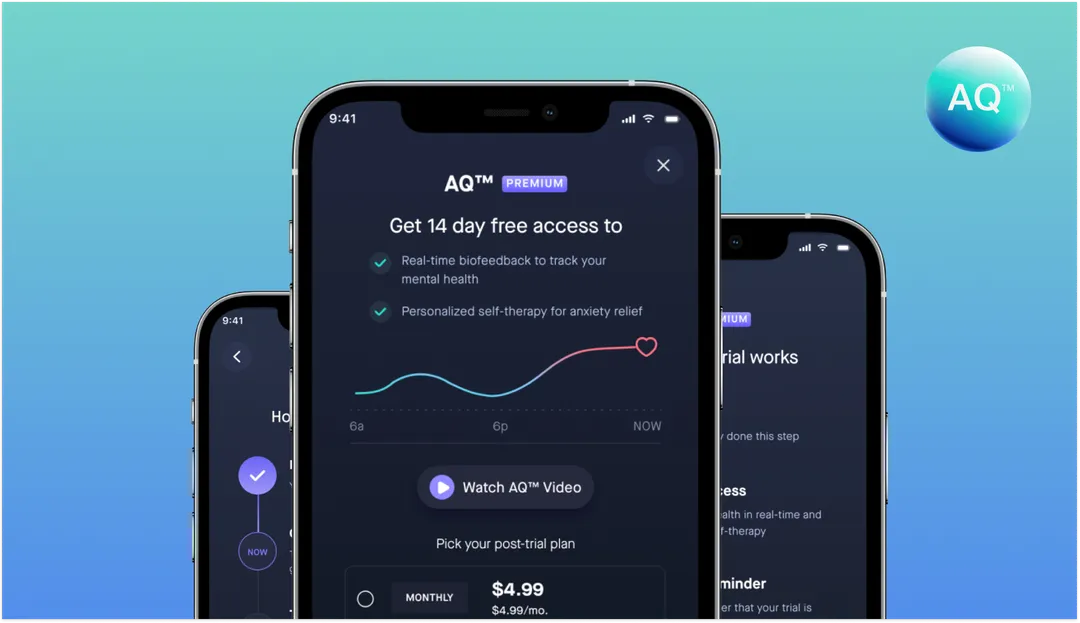
AQ Mindwell is an iPhone app that works with your Apple Watch to track how you are doing mentally. It reads your heart and brain activity through the day, builds that into a weekly and monthly picture, and sends something useful back each morning: what your day looked like, where your anxiety spiked, what to try next. There is also a set of soundscapes and short training sessions that adjust to your own readings.
I was brought in for one thing. People were downloading the app and leaving before they ever used it.
You cannot show someone this app in thirty seconds. There is no screen that looks impressive on day one, because what the app gives you is a picture of yourself over time, and that picture needs a few days of your own data in it before it says anything.
So the fourteen day trial is not really a sales offer. It is how you learn the app. Two weeks is about how long it takes for the morning check to become a habit, and for the weekly view to have enough in it to be worth opening.
Someone who never starts the trial has not decided AQ is too expensive. They have never seen what it does.
Four months of trial data, May to August 2022.
| New users | Trials | Converted | Start rate | |
|---|---|---|---|---|
| May '22 | 334 | 50 | 19 | 15.0% |
| Jun '22 | 1,022 | 163 | 53 | 15.9% |
| Jul '22 | 756 | 107 | 29 | 14.2% |
| Aug '22 | 97 | 11 | 0 | 11.3% |
| Total | 2,209 | 331 | 101 | 15.0% |
2,209 people installed the app. 331 of them started the free trial. That is 15%, and it was getting worse every month.
Now look at the next column. Of those 331, 101 went on to pay. That is 30%, which is a good number for an app like this.
So the app was working and the trial was working. Everything was going wrong in the one moment before any of it started. 85% of people were saying no to something they had never tried.
The screen we started with was built to sell a subscription. Three slides of features, a monthly or yearly choice with a discount badge, a promo code link, cancel anytime, terms and privacy. Every part of it assumed you had already decided to pay and were picking how.
Nobody was picking how. They were deciding whether to hand their card details to an app with a fourteen day clock on it. And the screen never said what happens in those fourteen days, when you get charged, or how to stop it.
We looked at how other subscription apps handle the same moment, mostly to see whether anyone was explaining how the trial works rather than selling around it. Most were selling around it.
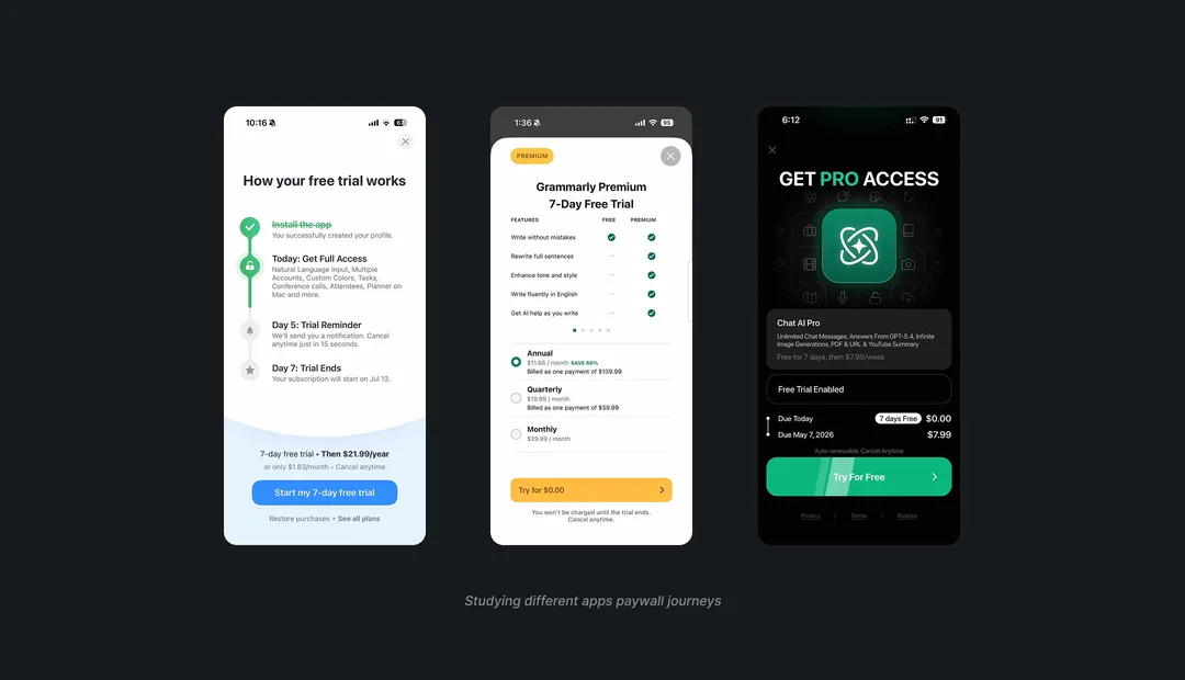
If people thought it was too expensive, we would be seeing a different pattern. They would start the trial, use it, and cancel before the payment date. That is not what was happening. They were not starting at all.
That points somewhere else. Not at the price, at the part they could not see: what happens after they tap the button.
01
The first step, install the app, arrives already ticked. They are one step in before they have done anything, which makes the next step feel smaller.
02
Today, day 12, day 14. Laid out so you can see exactly where you will be at each point before you agree to any of it.
03
The date, the amount, and how to cancel, in plain words. Hiding it is the thing people are afraid of, so saying it out loud is the whole fix.
04
Get them in first, then let them pick a plan. Asking someone to choose a tier before they have felt anything is asking the wrong question first.

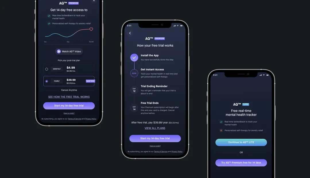
Three screens instead of one. The paywall itself got stripped back to two lines about what you get, a live graph of your own readings, a short video, and the plan choice. Everything that was selling rather than explaining came out.
The second screen is the one that mattered. How your free trial works lays the fourteen days out as a list you can follow. Install the app, done. Get instant access, that is now. A reminder on day 12. Payment on day 14, and you can cancel any time before it. The price sits underneath in plain words instead of a badge.
The third screen catches people on their way out. Rather than losing them completely, AQ Lite offers the tracker for free with the therapy side locked, and keeps the trial one tap away.
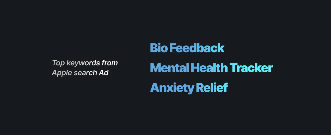
Partway through, the client shared the top three keywords from their Apple Search Ads campaign. Mental health tracker. Biofeedback. Anxiety relief. Those are the words people were actually typing to find AQ.
So those became the words on the screens. Real-time biofeedback to track your mental health. Personalized self-therapy for anxiety relief. Free real-time mental health tracker. Not because the phrases are elegant, but because someone who searched for anxiety relief, tapped an ad, and landed here should see the exact thing they came looking for, in the words they used to look for it.
It costs nothing to do and it removes a small piece of doubt. The screen stops asking people to translate.
It all came down to one number. In August, the month this work started, only 11% of new users were starting the trial. That figure had been sliding all year, down from 15% in May. Everything on those three screens was built to move it.
After the redesign, 48 out of 149 new users started a trial. That is 32%, against 11% in the month before the change, and 15% averaged across the four months on record.
Both are small samples, so I would want another quarter before calling it settled. But the gap is too big to be chance, and it moved the way we expected. People were not saying no to the price. They were saying no to not knowing.
The number I would watch next is the other one. 30% of people who started a trial used to go on to pay. If the new screens work partly by bringing in people who were never going to subscribe, that number will drop. Twice as many trials only counts if they are real ones.