Blazeup
Case study 05 · Brand identity
The client arrived with a product and no name. The name came out of the team. I set the design direction and built the mark, first sketch to finished construction in four days.
- Role
- Design direction. Logomark, concept to construction.
- Product
- An AI platform for business operations across HR, finance, IT, projects and CRM
- Timeline
- Four days for the mark, first sketch to final construction
- Year
- 2025
The brief
Blazeup is an AI platform that runs business operations across HR, finance, IT, projects and CRM. The client came to us with that concept and nothing to call it.
So the job was not a logo. It was a name that could be owned, positioning it could stand on, and a visual identity that read as a consequence of the name rather than a layer applied over it. Naming came first deliberately, because everything after it inherits the decision.
Four constraints
- Ownable
- Short, memorable, and viable to trademark globally.
- Coherent
- The identity had to read as an extension of the name, not an independent layer.
- No clichés
- Avoid the flames and sparks that a word like Blaze invites, without losing its intensity.
- Standalone
- The mark had to work alone as a recognisable B, down to favicon size.
The name
Blazeup is a compound of two words everyone already knows, which is what makes it ownable without being invented. Blaze carries intensity and speed. Up carries growth and elevation. Put together they stop being nouns.
Blaze
Intensity, speed
Up
Growth, elevation
Blazeup
A verb, not a noun
That was the strategic move, and it came out of the team rather than from me alone. What I owned was everything downstream of it: whether the identity could be a consequence of that name instead of a layer applied over it.
The mark
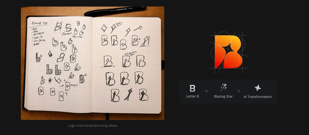
The mark is mine. The constraint I cared most about was avoiding flames, because every energy brand reaches for fire and fire is the least ownable image there is. So it went to the moment before the fire rather than the fire itself.
A letter B built from a comet path, with a four-point spark embedded inside the counter. The comet gives it direction, which is the Up. The spark is the point of ignition, which is the Blaze. Neither one is a flame.
I constructed it on a grid keyed to the x-height of the lowercase b, so the mark and the wordmark share proportions rather than merely sitting beside each other. It holds as a standalone B at favicon size, which was the fourth constraint. From first sketch to finished construction it took four days.
Colour
A heat gradient from yellow through red, held down by a near-black. The gradient carries the energy and the black stops it becoming noise, which is the usual failure mode of a fire palette. Two logo variants only: primary and reverse.
Typography
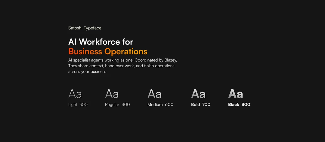
Satoshi, set as a lowercase wordmark. The mark is already sharp and directional, so setting the name in lowercase pulls the temperature down and keeps the whole thing approachable rather than aggressive.
Five weights, which is enough for a product with dense interfaces and not so many that the system drifts.
Light
300
Regular
400
Semi Bold
600
Bold
700
Extra Bold
800
What came of it
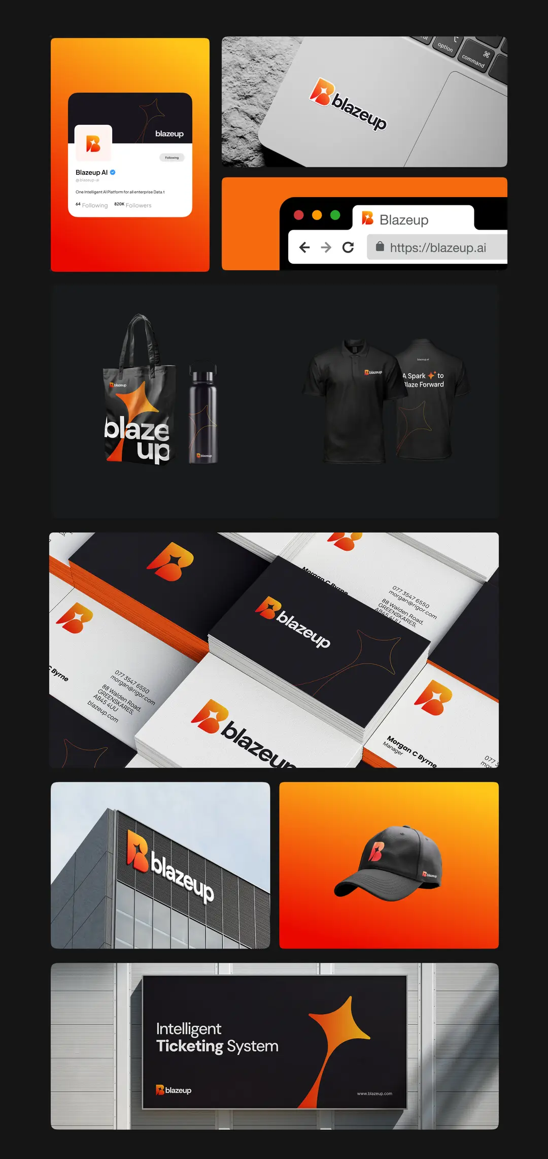
The name shipped, and everything downstream inherited it cleanly: the mark, the palette, the wordmark, the product UI, the website. That is the whole argument for naming first. When the name carries the positioning, the identity has something to be a consequence of.
Blazeup is now Lollypop’s first product rather than another client engagement, and it went to market with a brand that reads as deliberate rather than assembled.
Recognition
The identity has since won two international awards, both judged on the work rather than on the name of the client behind it.
2026
Red Dot Award
2026
IBDA