Bella
“I want to be in touch with my child and everything she does when I am not home.”
Occupied all day. Checks in at lunch and on the commute home. Comfortable with detail and willing to go looking for it.
Case study 04 · Parent app redesign
Miko is a companion robot for children. The app their parents used to set it up did almost nothing else. We redesigned it into the place parents actually stay connected to their child’s day.
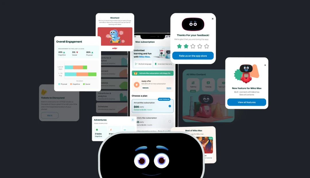
The robot was the product. The app was an afterthought: parents opened it once to pair the device and then had no reason to return. Static screens, a progress report nobody could read, and no way to be part of what the child did all day.
That is a retention problem disguised as a UI problem. A parent who never opens the app never sees what the robot is worth, and never upgrades.
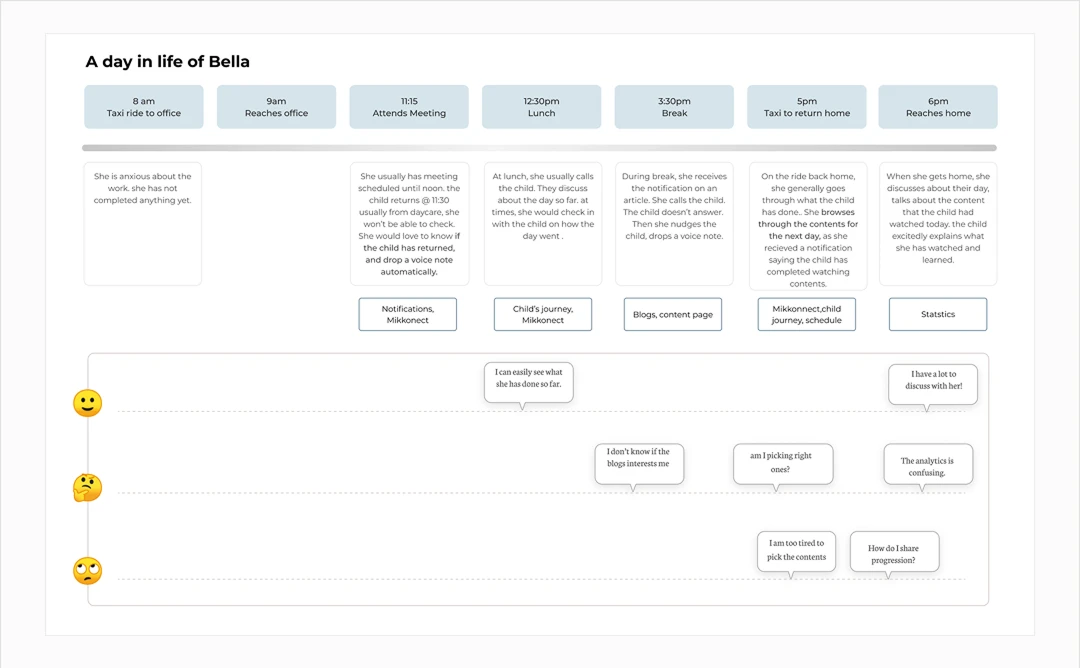
I was in the discovery sessions and stakeholder reviews from the start, so the personas were not something handed to me once they were finished. They drove almost every visual decision that came after.
“I want to be in touch with my child and everything she does when I am not home.”
Occupied all day. Checks in at lunch and on the commute home. Comfortable with detail and willing to go looking for it.
“I am too caught up with work to spend time with my child during the week.”
Never opened the settings and never will. Wants the week in a glance, not a product to learn. In most households this parent had no account at all.
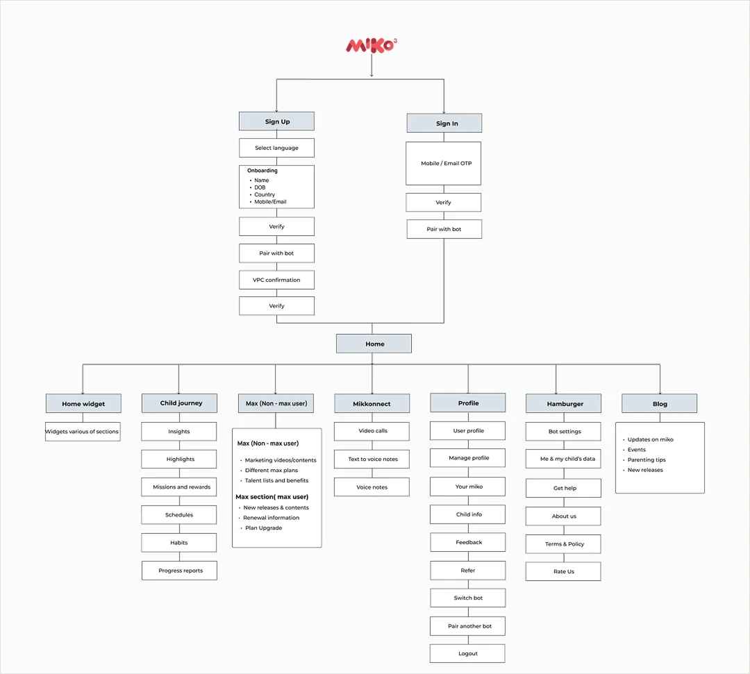
A parent app about a child’s learning wants to be a dashboard. Charts, streaks, scores. That works for the parent who researched the robot and set it up. It fails the other one, and in most households that is half the audience.
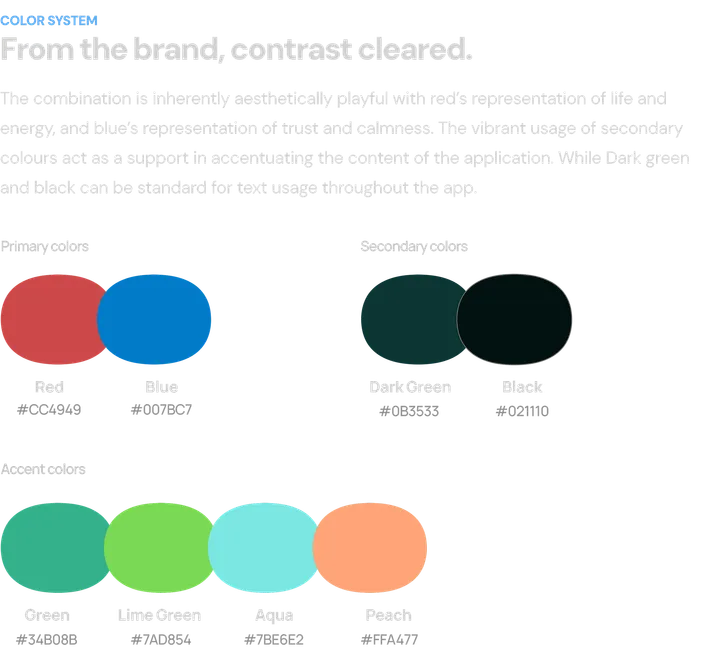
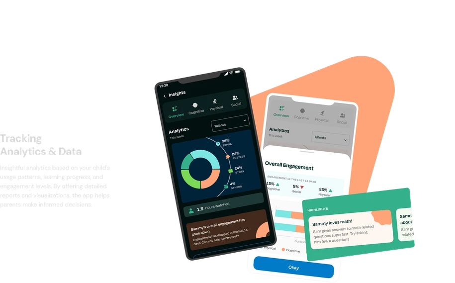
So we chose sentences over charts. Insights are written in plain language first, with visualisation as support rather than the main event. It lowers the effort to read, and it lands harder: “she watched three dance videos and asked to try it herself” does something a bar chart cannot.
That single decision set the tone for the whole visual system: fewer numbers, more language, generous space, and a premium feel that does not depend on data density.
Suggestions carry the parent through content discovery. Clear hierarchy so data is visible without hunting for it.
Content recommended against what the child likes and where they are behind. Analytics shaped by the child’s own behaviour, not a generic template.
Structured, simple layouts. Numbers presented so they can be understood at a glance rather than decoded.
Plain language, and a language choice at onboarding. Miko sells across regions where English is not the household default.
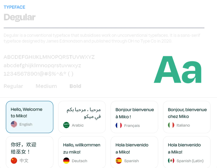
This is the part I owned. The brief asked for premium, which usually gets interpreted as dark surfaces and tight type. For something opened one-handed for ninety seconds by a parent who never configured it, that is the wrong reading.
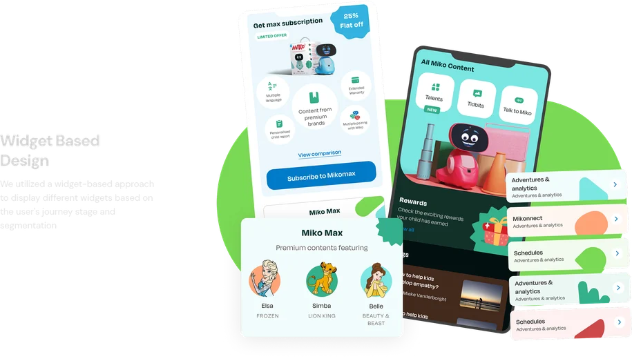
Premium here meant restraint: generous spacing, one accent doing the work, and typography large enough to read without attention. The home screen became widgets rather than a fixed layout, so what surfaces first can follow the child rather than the template.
Mikkonnect, the calling feature, got promoted to a permanent place. It is the emotional core of the product and it was previously buried behind navigation.
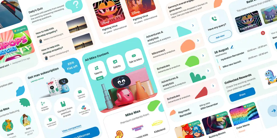
01
What Sammy is interested in is stated in a sentence. He answers maths questions fast, so try asking him a few more. The chart still exists, one tap behind a button, for the parent who wants to go deeper. Nobody has to read a donut chart to learn something about their own child.
02
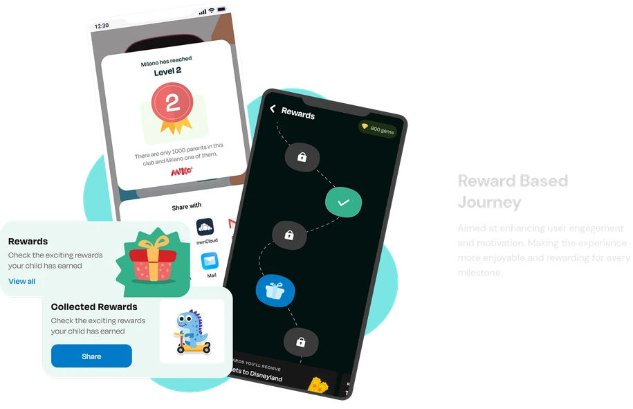
Adventures, rewards and scheduled habits turn the app from a setup utility into a surface worth opening on an ordinary Tuesday. Before this, a parent had no reason to return after pairing the device.
03
Habits, reminders and a nudge to remind Sammy let the parent influence what happens next rather than only reviewing what already happened. That is the difference between a report and a relationship.
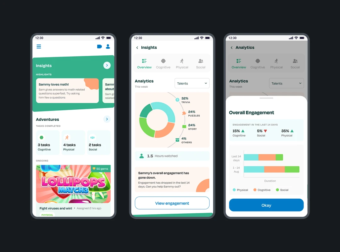
The app went from a pairing utility to a daily surface: written insights, scheduling, habits, events, and calling in one place, with a second caregiver finally able to have their own access.
The client’s own goals for it were engagement and subscription conversion. I do not have post-launch numbers, so I will not claim any.