Mosambee POS
Case study 06 · Fintech, payments
A shopkeeper with a card machine, a QR standee, a cash box, and a paper notebook. Mosambee collapses all four into the phone already in their pocket, then puts the shop online. I led design on this with two other designers: ten modules, fifteen payment flows, 573 screens.
- Role
- Lead designer, hands on across all modules
- Team
- One UX designer, one UI designer, and me
- Platform
- Mobile and on POS hardware
- Year
- 2021

A phone instead of a terminal
Before Mosambee, a shopkeeper in Indian retail ran four parallel systems. A card machine from one bank. A QR standee from a payments company. A cash box. And a paper notebook for the regulars who settle at the end of the month. Four places money lived, reconciled by hand at closing time.
Mosambee collapses all four into the phone already in their pocket. The phone becomes the terminal, the QR, the register, and the credit ledger. Then it goes one step further and gives the shop a catalogue customers can browse, which for most of these businesses is the first time they exist online at all.
Lollypop was brought in to redesign it end to end. Ten modules, fifteen payment and transaction flows, 573 screens. I led the design and stayed hands on across all of them, with one UX designer and one UI designer.
The mark came first
The branding work ran ahead of the product work, which is unusual and turned out to be the right order. The existing logo was dated in a way that undercut everything else, so we kept its bones, simplified it into something abstract enough to survive as a 48 pixel app icon, and let the palette come out of the mark rather than get applied to it afterwards. By the time we started on flows there was already a design direction to build against.
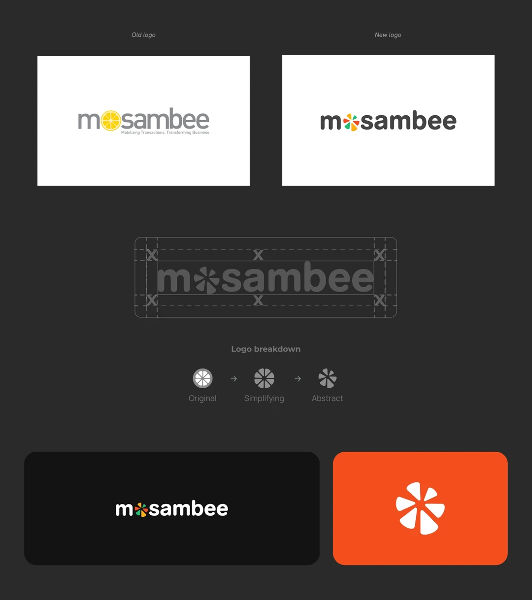
Design direction
Montserrat, in three weights. Geometric, open apertures, and lining numerals that keep their shape at small sizes, which matters when the most important element on almost every screen is a rupee amount read at arm’s length across a counter. It also had to hold up set in a partner bank’s colours without looking borrowed.
On colour, payments defaults to blue because payments is sold to banks. Mosambee’s own app is used by a shopkeeper who is not a banking customer and does not want to feel like one, so the house theme went the other way. Yellow, green, and orange, each with a five step tint ramp so brightness had somewhere to go on a dense screen.
That created one problem worth naming. The brand orange sits at #F44E21, close enough to red that a failed transaction would have been ambiguous against it. So failure got a dedicated red from outside the brand palette. At the time that felt like housekeeping. It turned out to be the decision the whole system rested on.
- Typeface
- Montserrat
- Weights
- Bold, SemiBold, Regular
- H1
- 24 / 34
- H3
- 18 / 24
- H4
- 16 / 24
The notebook is a payment method
Informal credit is how a large share of Indian retail actually runs. The regular takes what they need and settles at the end of the month, recorded in a notebook under the counter. Any app that asks a shopkeeper to give that up loses to the notebook.
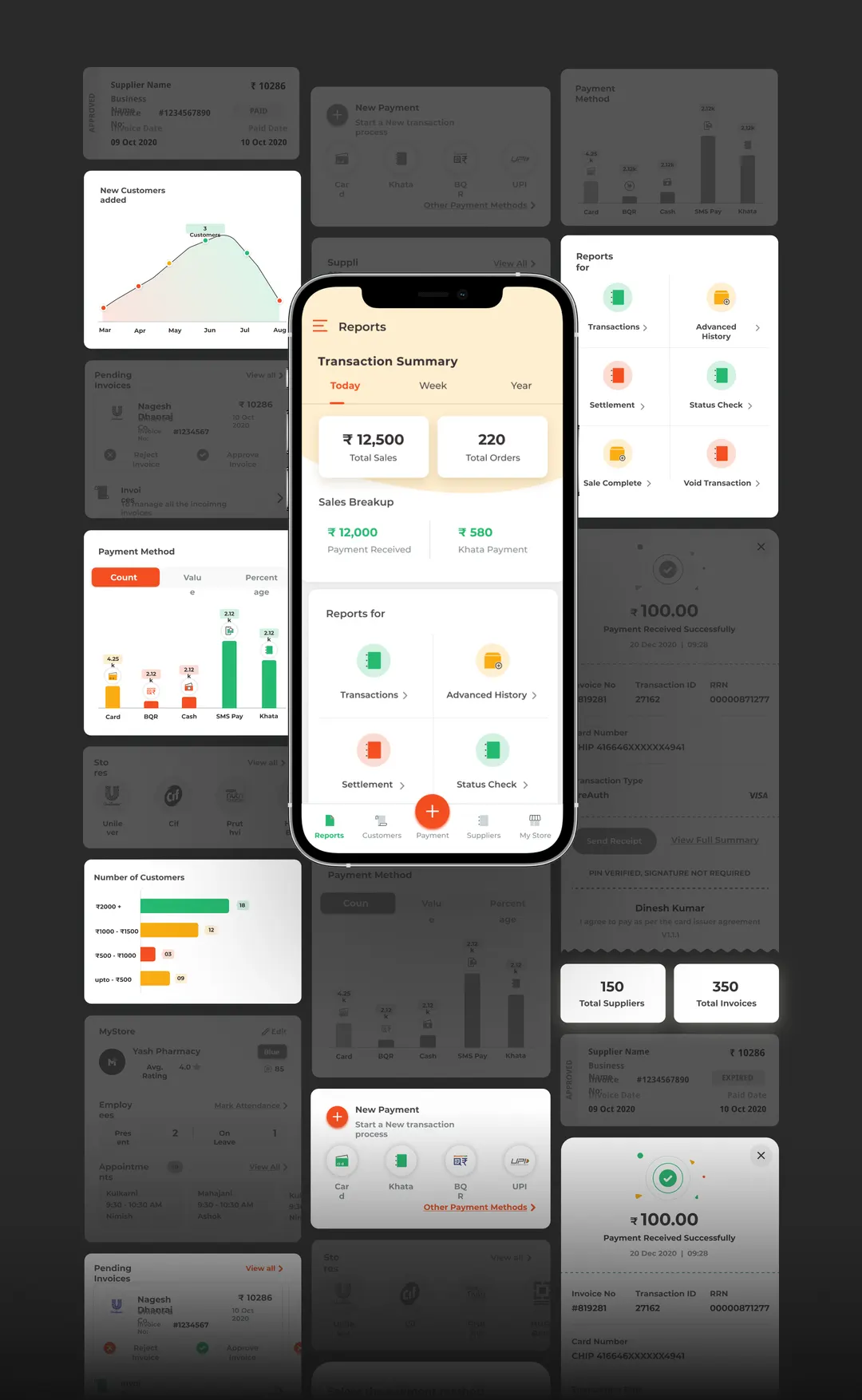
So Khata is not a separate ledger sitting beside the payments. It is a method inside the collect flow, next to card and UPI. The shopkeeper enters an amount, picks Khata instead of card, and the debt is recorded against a saved customer with the same receipt, the same history, and the same reporting as every other transaction.
Nothing is taken away from them. The notebook is not banned, it is out-competed. That is what digitising a small business actually looks like, and it is the reason the customer module and the storefront had somewhere to grow from: once the regulars are in the app as records rather than names on a page, you can sell to them.
The half nobody demos
In a payments product the happy path is the easy half. The card reader disconnects. The network drops. The bank switch times out. The customer mistypes a PIN and re-enters it. A payment sits pending, completes, then gets voided an hour later.
A shopkeeper who cannot tell whether they got paid stops trusting the app, and a shopkeeper who does not trust the app goes back to cash. So the thing that actually needed designing was not the collection screen. It was everything that happens after the merchant hits collect.
We walked the matrix
We ran workshops with the client and spoke with a handful of shop owners. That told us roughly what we expected: they are not reading the screen, they are looking for one thing, and they want it in the first second.
The work that actually changed the product was duller. We listed every transaction type the platform supported, listed every status each one could land in, and walked the grid cell by cell, testing what the screen had to say in each case. That exercise is where the receipt system came from.
One receipt, every combination
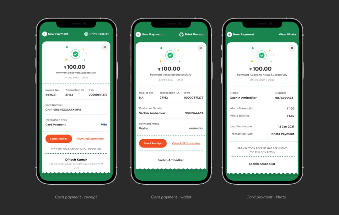
Card, cash, cash with tip, cheque, UPI, QR, SMS Pay, wallet, EMI, PreAuth, purchase with cashback, Khata, withdrawal. Against success, pending, failed, and network error. Designed as separate screens, that is an inconsistency problem and a maintenance problem before a single one ships.
So it is one template, instantiated per method. The layout holds. What changes is the status treatment, the fields relevant to that method, and the one line that matters most in that moment. On a cash withdrawal that line is an instruction to hand over the cash. On a failed card payment it is what to do next. A failed card and a failed UPI read the same way, which is the entire point.
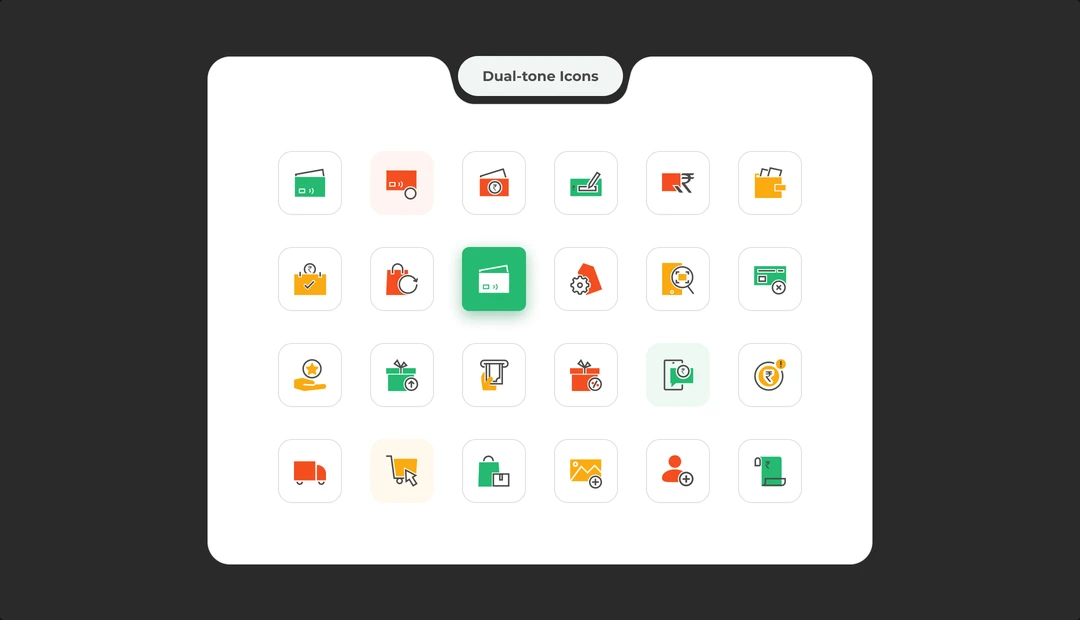
Eighty four icons, one solid set
Eighty four icons, drawn as a single solid set and documented as one sheet.
The reason is vocabulary rather than craft. PreAuth, settlement, mini statement, balance enquiry, purchase with cashback, void, and Khata have no shared visual convention to borrow from, and most of them have to sit beside a number at 32 pixels and still be readable. Nothing off the shelf covered it, so the set was drawn from scratch. We explored a stroke variant alongside it and shipped the solid one.
573 screens, one system
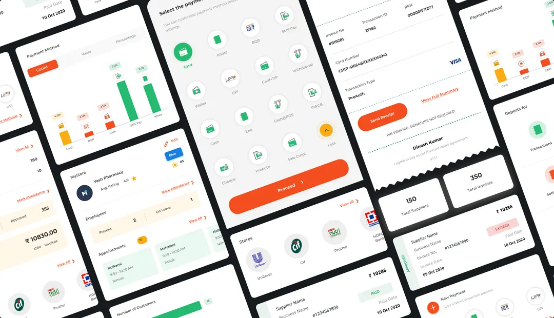
At this scale, consistency could not depend on someone remembering how the last screen worked. We built the product from a repeatable set of cards, list rows, status tags, charts, payment selectors, receipt blocks and action patterns.
The same parts had to stretch across payments, reports, staff, suppliers and storefronts without making each module feel like a different product. Reuse made the build faster, but the bigger win was familiarity: once a merchant learned one pattern, it kept working everywhere else.
One app, many banks
The platform was also white labelled to bank partners, so the same app shipped as HDFC SmartHub and as an Axis Bank product. A theme is two to four tokens, a primary and a soft tint plus a secondary for some partners, and nothing else moves. It is also the reason status colour had to sit outside the brand palette: HDFC’s secondary is #DD3227, and a partner’s own accent should never read as an error.
- #F9AC12 primary#25BA70 secondary#F44E21 accentMosambee
- #97144D primary#F5E8ED tintAxis Bank
- #094D8D primary#E6EDF4 tint#DD3227 secondary#F8D6D4 tintHDFC SmartHub
What came of it
One app where there were four systems and a notebook. A shopkeeper can take payment fifteen different ways, see what sold today and this year, keep track of who still owes, and put the shop online for customers to browse. That was the brief, and it shipped in 2021.
Mosambee today reports over a million merchants, runs on HDFC, SBI, Indian Bank, Visa, Amex and Diners rails, and holds PCI MPOC and Apple Tap to Pay certification. The app has since been rebuilt as a super app called Mod91.
I do not have usage data for the 2021 build and I am not going to claim the growth as mine. What I will claim is the system underneath it: 573 screens across ten modules, one receipt template that holds under every combination the platform can produce.